Release Notes 2026
Frequently Asked Questions!
How do I see descriptions of codes in enquiry screens?
How do I access field level help?
How can I delete a payment run
How do I stop over receipting of orders
Why has my transaction not appeared on the payment run?
How do I stop a user posting to a prior and future period
How to copy and delete lines during data entry?
Prevent user posting to specific balance classes
Download Templates
User setup requires multiple screens and is complicated!
Changing security access to a user
Out of office
How do I give a user read only access?
De-allocate and an AP Payment
Can I run a report to view security groups against my users?
Hints and Tips!
Useful information to include when raising Financials cases
Navigation Hints and Tips
Browse Timeouts
Accounts Payable Quick Cards
Accounts Payable Supplier File
Accounts Payable Data Entry
Log Invoice/Credit Note
Enter a logged Invoice
Non Purchase Order Related Invoice Entry
Order Related Invoice
Order Related Invoice with Mismatches
Order Related Invoices - mismatch scenarios
Mismatch Types
Invoice and Credit Note Matching
Accounts Payable Enquiries
Accounts Payable Payments
Payment Processing
AP Payment Cancellation
Create a manual payment
Re-run Bacs Remittance
Payment Processing Audits
Single Supplier Payment Processing
Transaction Maintenance
CIS Processing
Accounts Payable Code Tables
Accounts Receivable Quick Cards
Customer Maintenance
Data Entry and DDI Mandates
Enquiries
Cash Allocation
Credit Control
Student Sponsor
General Ledger Quick Cards
Chart of Accounts Setup
Create a new nominal code
Create management and analysis codes
Creating and Amending Nominal and Management code relationships
Create a new GL Structure Element
General Ledger Data Entry
Journal Entry
General Ledger Journal Multi Level Authorisation
Modernisation Budget Upload
Journal Upload
General Ledger Enquiries
Account Details
Trial Balance
GL Enquiries - Balance Sheet & Profit and Loss
Enquire across multiple years
Transactions Enquiries
Period and Year End Close
General Ledger Security
Fixed Assets Quick Cards
Prompt File - Asset Creation Updated
Fixed Assets Period End & Depreciation Updated
Revaluation
Disposals
Relife
Purchasing Management Quick Cards
Inventory Management Quick Cards
Return to Store
Stock Taking
Create Demand on Store (Financials)
Bin Transfers
Stock Disposal
Stock Adjustments
Import Tool Kit
Reconciliation Processes - Helpful how-to guides
Daily Checks
General Ledger Reconciliation Reporting
Accounts Payable Reconciliation Reporting
Accounts Receivable Reconciliation Reporting
Fixed Assets Reconciliation Reporting
Purchasing Management Reconciliation Reporting
Procurement Portal
Procurement Portal Overview
Navigation
Requisitions
Orders
Authorisation
Receiver
Invoice Clearance
Portal Administration
Procurement Portal – Teams Setup
Invoice Manager
Bank Reconciliation
Bank Reconciliation Overview
Bank Reconciliation Menus Explained
Bank Reconciliation Company Controls
Bank Reconciliation Code Tables
Transaction Types and Sub Types
Bank Reconciliation Enquiries
Bank Reconciliation Reports
Manual Bank Reconciliation
Bank Reconciliation Take-on
Unmatching Transactions
Reporting
General Ledger Reports
Account Payable Reports
Fixed Assets Reports
Sales Invoicing Reports
Accounts Receivable Reports
Bank Reconciliation Reports
Purchase Invoice Automation (PIA)
March Release
February Release
January 2026
Deleting Supplier training data
Resetting password - Smart Workflow
Purchase Invoice Automation (PIA)
Adding a New User - Smart Workflow
Password Reset in Smart-Capture
How to Create a New User in Smart-Capture
Reprocessing Failed OCR Supplier Invoices
Suggested Testing Areas
Release Notes - New UI Improvements
June Release 2024 - New UI Improvements
May Release 2024 - New UI Improvements
April Release 2024 - New UI Improvements
Release Notes 2025
December 2025
November 2025
October 2025
September 2025
August 2025
July Release
June Release
May 2025
April 2025
March 2025
February 2025
January 2025
Release Notes 2024
December 2024
November 2024
October 2024
September 2024
August 2024
July 2024
June 2024 Release
May 2024 Functional Changes
Financials Design Improvements
User Interface Overview
User Preference Improvements
Alerts & Field Error Focus
The all new Data Grid!
Input Fields & Dynamic Validation
Screen Structure
Miscellaneous New Features
Generic Actions
Chart Functionality
Bring Your Own BI (BYOBI)
Collaborative Planning
Financial Reporting Consolidation
Business Process Manager
Request a Customer
Request a Supplier
Request a Sales Invoice
Request a Management Code
Request a nominal code
Create a Pay Request
API
Air Approvals
- All categories
- Financials Design Improvements
- User Interface Overview
User Interface Overview
Design Improvements
Shell & Header
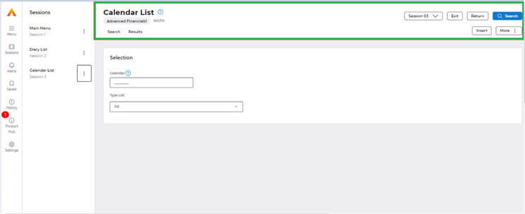
In the above screenshot portion with green outline is the page header where user could see the name of the current screen, action buttons such as exit, return, search, insert and then more kebab menu.
This section also holds the ‘session’ dropdown which helps the user to shift between the open sessions conveniently, following feedback from internal/external stakeholders on the desire for the feature.
Global Primary Actions:
Primary action buttons have been renamed to make more sense and avoid confusion:
· ‘OK’ has been changed to ‘Search’.
· ‘Update’ has been changed to ‘Save’.
· ‘Cancel’ has been changed to ‘Return’.
· ‘Update’ has been changed to ‘Save’.
· ‘Cancel’ has been changed to ‘Return’.
For example, previously the primary buttons ‘Exit, cancel’ and ‘Okay’ were not grouped.
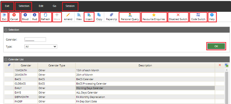
In the new system, the actions are placed conveniently together and return and exit better differentiate negative actions.
Whilst Save & Search are clearer positive actions to differentiate the need of the user depending on what action they are performing.


Global Chips:

1. Company Chip – Company name would be displayed on the page header as above and be more accessible on the page.
2. Map ID – ID of the current map which is open would be displayed as above to help users familiarise Screen Codes for quicker access through the menu search functionality.
3. More kebab menu - In the new UI, we have the more Kebab menu to accommodate the various pull-down items that were present in our existing UI (explained in detail in the split button vs more kebab menu section below)
Session Drop Down:
Session drop-down helps the user to shift between the open sessions conveniently without having to open up their menu if the user preference is to have the menu hidden by default.

This helps users see the sessions that are open and switch between the sessions by clicking on them.
Search/Results tab:
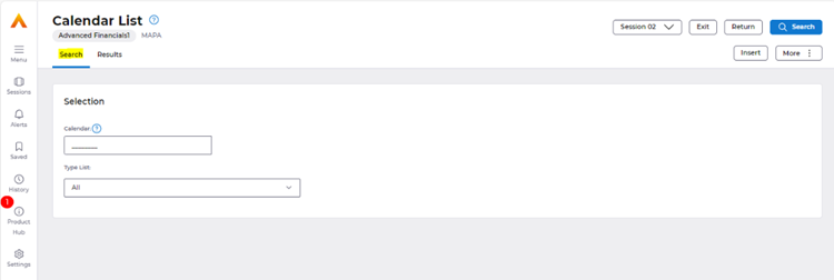
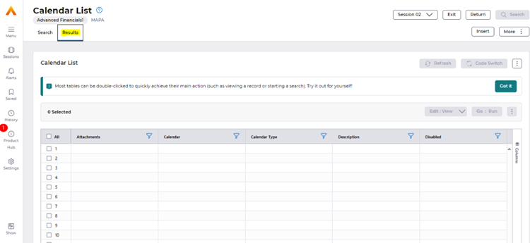
For all list screens where there is search criteria and an AG Grid which shows the results determined by these criteria. The page is bifurcated into ‘Search’ for the criteria & ‘Results’ for the data, which is presented in the AG Grid, to allow for a better screen capacity for engaging with the AG Grid.
Search is always a primary action here, for users to navigate between selection of their criteria to the results in the AG Grid.
Draw & Rail
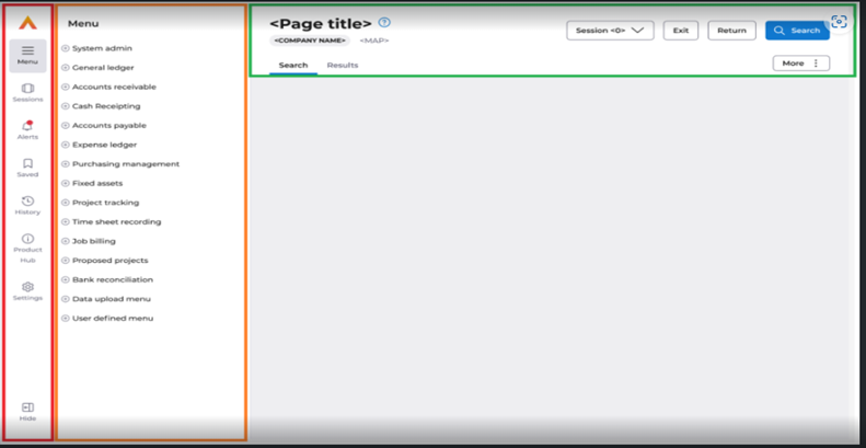
Rail (Red out line) – Rail provides quick access to menu, sessions, alerts, history, product hub and settings.
Draw (Orange outline) – The Draw would interchange options varying on the selection of the Rail.
Menu
Below screen shot refers to the draw section for Menu.
Initially, menu expands as a collapsed tree view (as below).
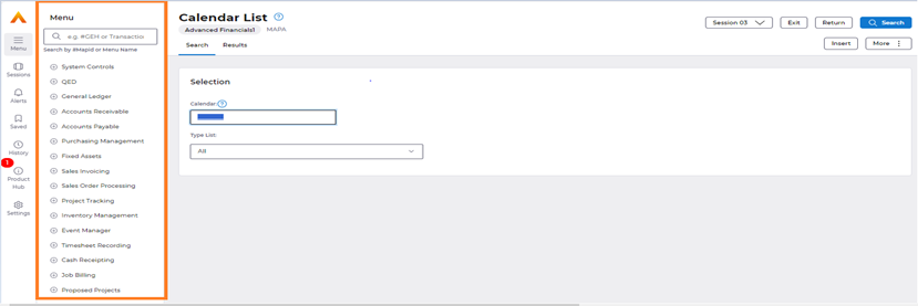
Upon clicking on the plus button, user could see an expanded tree view as below to click-into specific modules.
E.g. System Controls -> Definitions..

Screen Search
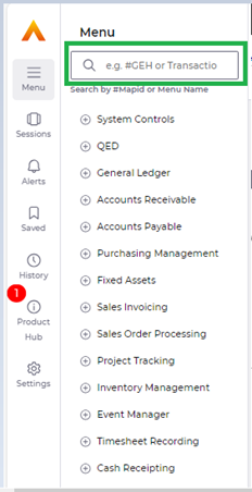
On the ‘Menu’ draw section, the system now offers an improved Function Search Capability.
Users can now either search directly for their specific module name or the screen ID which can be found in settings or using the MAP-ID chip. (e.g. “Supplier” or “#PBA”)
This can also be accessed from the homepage as a 'search-engine' styled feature allowing you to quickly navigate to your favourite items.
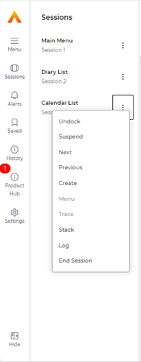
‘Sessions’ option on the rail
Here user can navigate between sessions that are open along with the session ID’s.
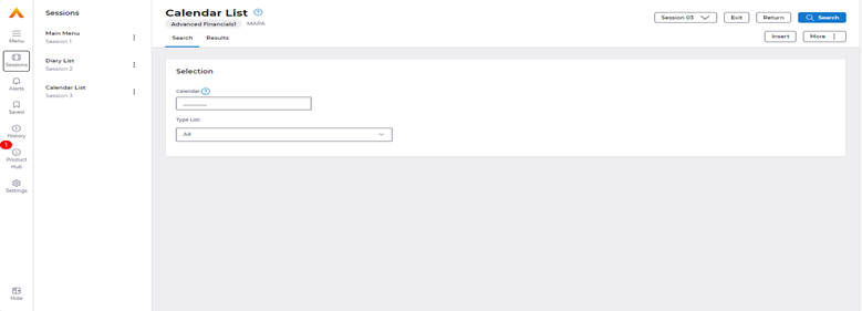
On the side of each session in the Draw, users can see a kebab menu which by clicking on will display session related actions that a user can take on the open sessions (shown below).
‘Saved’ option on the rail.
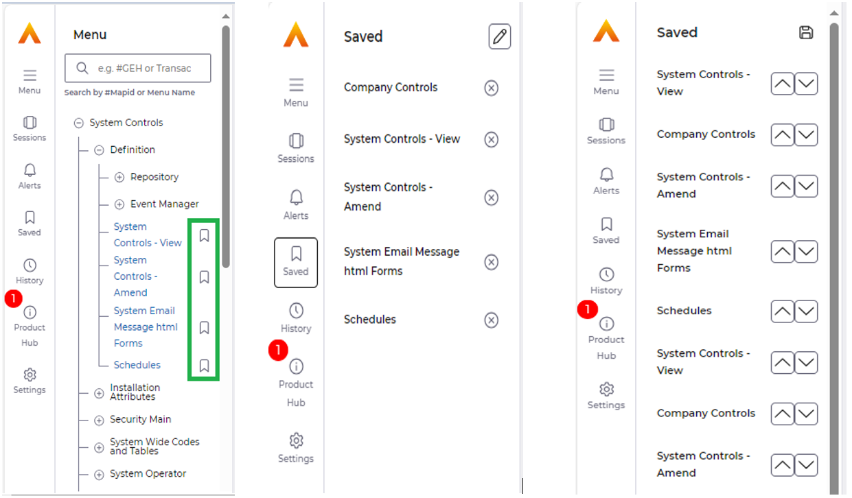
Users can quickly access their favourite menu items by utilising the new bookmarking functionality embedded in the Menu by selecting the bookmark icons highlighted in green below.
By Selecting the Bookmark icons, menu items will automatically be saved as per user preferences for future uses of the application in the ‘Saved’ section.
Users can re-arrange their saved items by using the pencil icon below (arrow & save icon will then be present), saving the order preference that they wish to display their most used screens within.
‘Alerts’ Menu
We have enhanced the alerting functionality greatly in the new user interface. To read more into the various aspects of the application where the improvements are. Please select the link below;
https://financials.helpdocs.io/article/6ojn5kyqjw-afx-alerts-field-error-focus
Product Hub
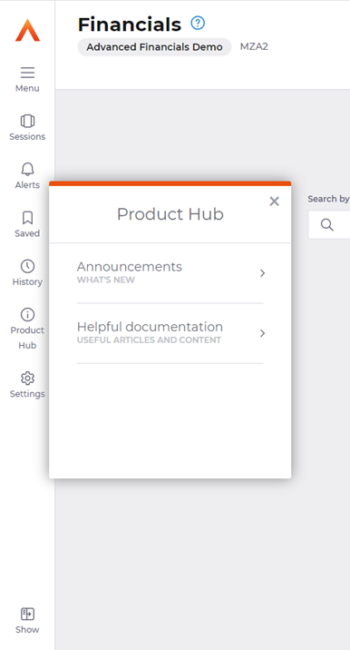
Upon selecting the Pendo ‘Product Hub’ from the Menu Rail, users will be able to view the updates which are available through the Financials Product Hub.
These are maintained and updated, so users can be kept informed with the latest updates and information.
Typically, there are two types of assets available for users to access through the Pendo Product Hub.
1. Announcements – These could be pertaining to new features available within the application.
2. Helpful Documentation – For informative content relating to useful information that could be accessed by the user.
Settings & User Preference Enhancements
For settings, please see the below article providing more details into the user preference based improvements the new interface brings, along with the configurations available through settings:
https://financials.helpdocs.io/article/0ijzrv6gjx-afx-user-preference-enhancements-settings
