Contents
The all new Data Grid!
Data Grid Improvements
Selection panel
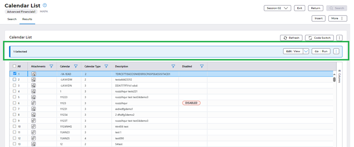
Selection panel can be found above the Data Grid as shown above. By default, the panel would be disabled and gets enabled upon selecting one or more rows.
Panel consists of the split buttons which are the line related actions and a more kebab menu which accommodates the line related actions under the ‘Session’ pull down items. (explained in detail in the split buttons and kebab menu section below).
The number of rows selected would be displayed in the selection panel (in the above screen shot 1 row is selected).
User Preferences & Customisation:
There are several options to customize the AG grid such as:
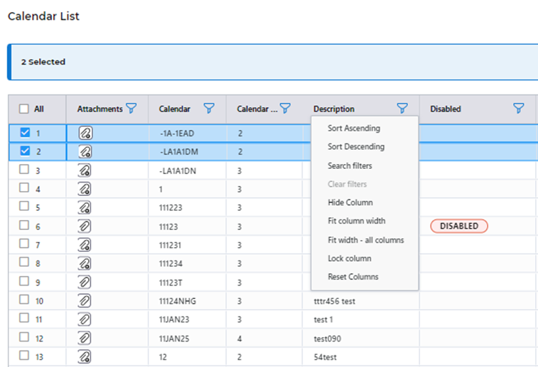
Sorting: Displaying the data in ascending/descending order.
Hide column: To hide a particular column this option could be used.
Fit column width: To adjust the width of the columns according to the size of the largest character in that column. ‘Fit width all’ option is there to apply this functionality to all the columns in the grid.
Lock Column: To prevent he column from horizontal scrolling.
Search filter – To search records based on a particular search criterion.
All these options could be found inside the filter icon on top of the column (screenshot below)
Hiding Columns
A ‘Columns’ button could be found on the right side of the AG grid as well clicking on which would open the list of columns as shown below. By unchecking the column name from this list, that column would be hidden.

Re-arranging Order and Size of Columns
By dragging and dropping column headers, the columns could be re arranged (screenshot below). Also, size of the columns could be adjusted by dragging.
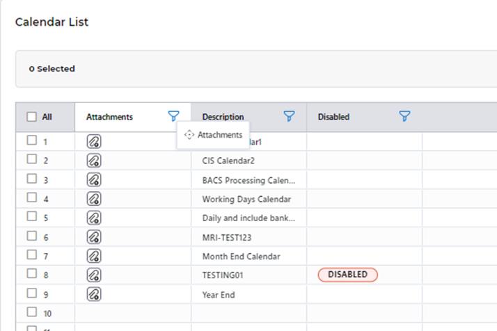
User preferences are saved for the customization made on the columns. I.e., as a user If I make any changes on the grid (ex: hiding a column, changing width etc), these changes would be saved. When I use any other screen and come back, the customization made on the columns would remain until reverted manually.
Infinity Scroll
Infinity scrolling is implemented in the AG grid that allows users to load and display a large set of data progressively as the user scrolls through the grid. As the user scrolls down, additional data is fetched and appended to the existing dataset, creating a seamless and continuous scrolling experience.
Upon loading the grid, an initial set of 15 rows is rendered to provide users with immediate visibility into the dataset. As the user scrolls down, additional rows are dynamically fetched and appended to the existing dataset, ensuring a continuous flow of data. Users experience a seamless transition between the initially loaded rows and the dynamically fetched ones, creating a smooth and responsive interaction.
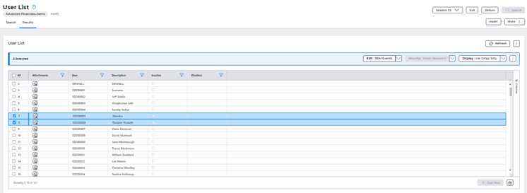
Row selection: Users can select rows by interacting with checkboxes and perform actions. (e.g. view, amend etc). Multiple rows could be selected and actioned. As users scroll through the grid, the visible rows change dynamically due to the nature of infinite scrolling.
It is important to note that Rows that move out of the visible frame loses their selected state, so users will only be able to action against rows which are visible in the 15 rows.
Split Buttons, Kebab Menu’s
The split buttons and kebab menus are introduced in the majorly to accommodate the pull-down items in the tool bar of the existing application’s UI.
Split Buttons
Out of the pulldown items available from the tool bar in the existing UI, there are many actions which are specific to the lines in the list/grid present in the screen a user may be accessing.
Let’s consider the APA screen which is the calendar list screen. This screen displays the calendar list.
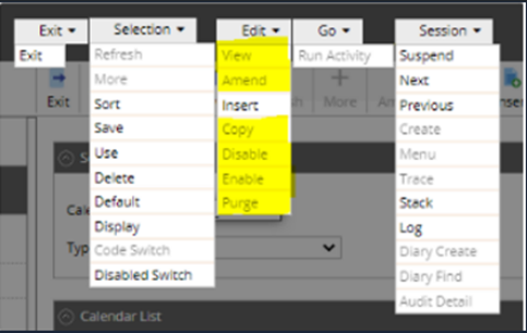
The above screenshot shows all of the pull-down items available in the screen of the existing UI. Out of these, the yellow highlighted ones are specific to the lines in the calendar list of the APA screen.
In the new UI, these line related actions would be accommodated in a split button in the selection panel that would be present above the grid as shown in the screen show below:
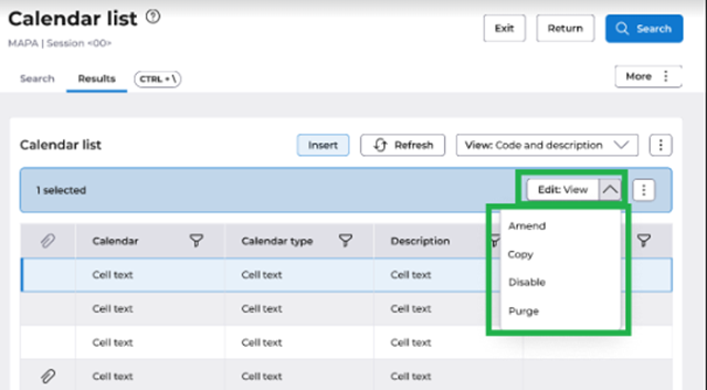
This allows for better focus on the most necessary actions, removing the focus from actions which aren’t relevant to the AG Grid and allowing focus on the actions which are commonly accessed by users for their data whilst utilising the same groupings that users were previously used to. E.g. ‘Edit’.
Kebab Menu’s
In the new UI, we have multiple Kebab menus to accommodate the various pull-down items that were present in the previous User interface (UI).
i. Kebab menu for the ‘selection’ pull down items.
The selection pull-down items which do not appear as separate buttons are accommodated in a kebab menu in the new UI (as below) both in the previous UI and in the new UI:
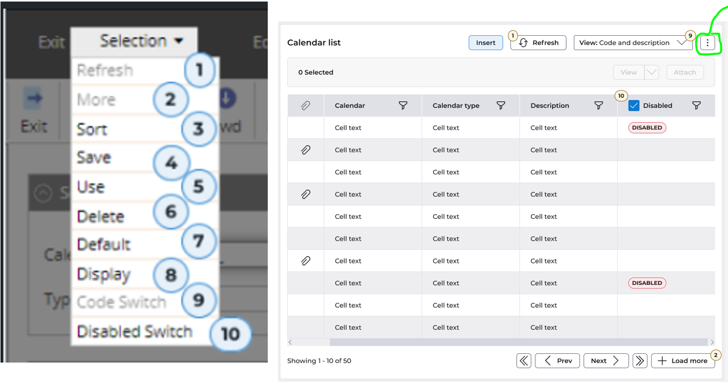
The most used actions which are exposed as buttons, will remain to be buttons, however other items which are in the menu option will now be transferred into the ‘More Kebab Menu’ for a cleaner user interface.
Out of these actions - refresh, more code switch, disabled switch would be separate buttons. ‘Disabled’ would be a separate column in the AG grid. The remaining items would be present in the Kebab menu as shown above.
ii. Kebab Menu for the Sessions
This Kebab menu accommodates the actions under the ‘Session’ pull down items in the existing UI in the Sessions draw.
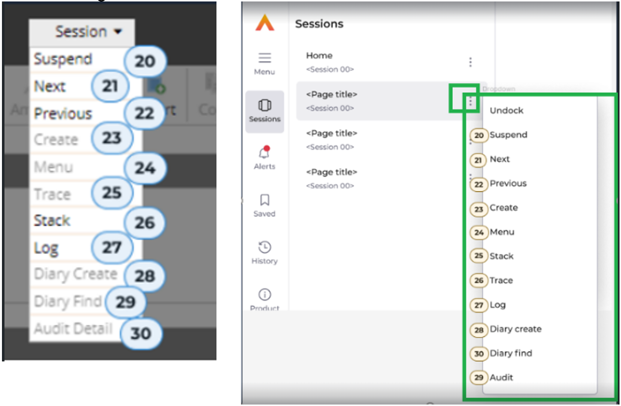
The ‘sessions' icon on the rail will show the list of sessions on which the user is working on. Each session title would have this kebab menu. The actions in the kebab menu would differ based on the screen but are placing the actions in a more relevant position for the users.
iii. Kebab Menu on the selection panel
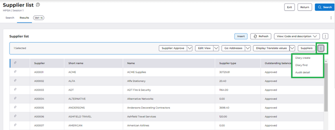
When there is any list related action in the 'session' pull down for a particular screen, those actions would be displayed in the kebab menu on the selected panel instead of the 'session' kebab menu.
In these cases, when there are no list related actions within 'session' items, then this kebab menu on the selected panel will not be displayed.
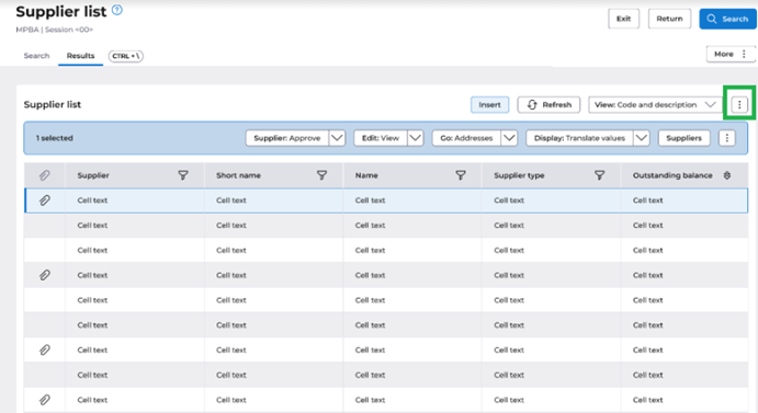
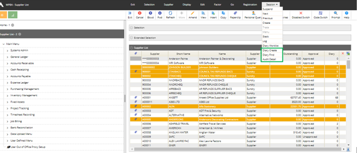
Example: Supplier List Screen
MPBA Screen has 3 list related actions (highlighted in green) under ‘Sessions’ pulldown.
In the new UI, these line related actions would be displayed on kebab menu on the selection panel as shown in the screenshot below:
iv. ‘More’ Kebab Menu
As described previously, the line related actions would be present inside the split button on the selection panel above the grid in the new UI.
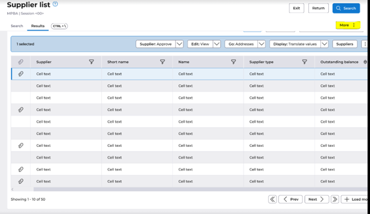
Similarly, there would be non-list related actions too that would be present in the pull-down items (excluding ‘selection’, ‘edit’, ‘session’, ‘exit’). Those actions would be accommodated inside the more kebab menu.
Example: Supplier List Screen
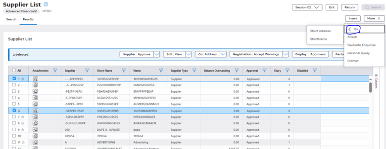
Consider PBA screen (screenshot above). Among the pull-down actions, the non-list related items are Go>Short address and Go> Short name. These are accommodated inside the more kebab menu.
This kebab menu accommodates the following examples: ‘Attach’, ‘Prompt’, ‘Personal enquiry’, ‘Favourite enquiry’.
