Release Notes 2026
Frequently Asked Questions!
How do I see descriptions of codes in enquiry screens?
How do I access field level help?
How can I delete a payment run
How do I stop over receipting of orders
Why has my transaction not appeared on the payment run?
How do I stop a user posting to a prior and future period
How to copy and delete lines during data entry?
Prevent user posting to specific balance classes
Download Templates
User setup requires multiple screens and is complicated!
Changing security access to a user
Out of office
How do I give a user read only access?
De-allocate and an AP Payment
Can I run a report to view security groups against my users?
Hints and Tips!
Useful information to include when raising Financials cases
Navigation Hints and Tips
Browse Timeouts
Accounts Payable Quick Cards
Accounts Payable Supplier File
Accounts Payable Data Entry
Log Invoice/Credit Note
Enter a logged Invoice
Non Purchase Order Related Invoice Entry
Order Related Invoice
Order Related Invoice with Mismatches
Order Related Invoices - mismatch scenarios
Mismatch Types
Invoice and Credit Note Matching
Accounts Payable Enquiries
Accounts Payable Payments
Payment Processing
AP Payment Cancellation
Create a manual payment
Re-run Bacs Remittance
Payment Processing Audits
Single Supplier Payment Processing
Transaction Maintenance
CIS Processing
Accounts Payable Code Tables
Accounts Receivable Quick Cards
Customer Maintenance
Data Entry and DDI Mandates
Enquiries
Cash Allocation
Credit Control
Student Sponsor
General Ledger Quick Cards
Chart of Accounts Setup
Create a new nominal code
Create management and analysis codes
Creating and Amending Nominal and Management code relationships
Create a new GL Structure Element
General Ledger Data Entry
General Ledger Enquiries
Account Details
Trial Balance
GL Enquiries - Balance Sheet & Profit and Loss
Enquire across multiple years
Transactions Enquiries
Period and Year End Close
General Ledger Security
Fixed Assets Quick Cards
Prompt File - Asset Creation Updated
Fixed Assets Period End & Depreciation Updated
Revaluation
Disposals
Relife
Purchasing Management Quick Cards
Inventory Management Quick Cards
Return to Store
Stock Taking
Create Demand on Store (Financials)
Bin Transfers
Stock Disposal
Stock Adjustments
Import Tool Kit
Reconciliation Processes - Helpful how-to guides
Daily Checks
General Ledger Reconciliation Reporting
Accounts Payable Reconciliation Reporting
Accounts Receivable Reconciliation Reporting
Fixed Assets Reconciliation Reporting
Purchasing Management Reconciliation Reporting
Procurement Portal
Procurement Portal Overview
Navigation
Requisitions
Orders
Authorisation
Receiver
Invoice Clearance
Portal Administration
Procurement Portal – Teams Setup
Invoice Manager
Bank Reconciliation
Bank Reconciliation Overview
Bank Reconciliation Menus Explained
Bank Reconciliation Company Controls
Bank Reconciliation Code Tables
Transaction Types and Sub Types
Bank Reconciliation Enquiries
Bank Reconciliation Reports
Manual Bank Reconciliation
Bank Reconciliation Take-on
Unmatching Transactions
Reporting
General Ledger Reports
Account Payable Reports
Fixed Assets Reports
Sales Invoicing Reports
Accounts Receivable Reports
Bank Reconciliation Reports
Purchase Invoice Automation (PIA)
March Release
February Release
January 2026
Deleting Supplier training data
Resetting password - Smart Workflow
Purchase Invoice Automation (PIA)
Adding a New User - Smart Workflow
Password Reset in Smart-Capture
How to Create a New User in Smart-Capture
Reprocessing Failed OCR Supplier Invoices
Suggested Testing Areas
Release Notes - New UI Improvements
June Release 2024 - New UI Improvements
May Release 2024 - New UI Improvements
April Release 2024 - New UI Improvements
Release Notes 2025
December 2025
November 2025
October 2025
September 2025
August 2025
July Release
June Release
May 2025
April 2025
March 2025
February 2025
January 2025
Release Notes 2024
December 2024
November 2024
October 2024
September 2024
August 2024
July 2024
June 2024 Release
May 2024 Functional Changes
Financials Design Improvements
User Interface Overview
User Preference Improvements
Alerts & Field Error Focus
The all new Data Grid!
Input Fields & Dynamic Validation
Screen Structure
Miscellaneous New Features
Generic Actions
Chart Functionality
Bring Your Own BI (BYOBI)
Collaborative Planning
Financial Reporting Consolidation
Business Process Manager
Request a Customer
Request a Supplier
Request a Sales Invoice
Request a Management Code
Request a nominal code
Create a Pay Request
API
Air Approvals
- All categories
- Financials Design Improvements
- Miscellaneous New Features
Miscellaneous New Features
Updated
by Tauqeer Hussain
Back to Top Functionality:
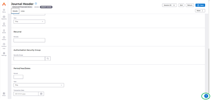
Back to Top button is implemented in all screens where the vertical scroll bar is applicable, so that the user can quickly reach the top of the page from bottom by simply selecting the blue arrow.
Frozen Header, Vertical & Horizontal Anchor Menu's
When scrolling through the UI, the header will be hidden to allow for better utilisation of the full screen.
When reaching the bottom of the page, or triggering the scroll-up, the header and its primary actions will become visible once more.

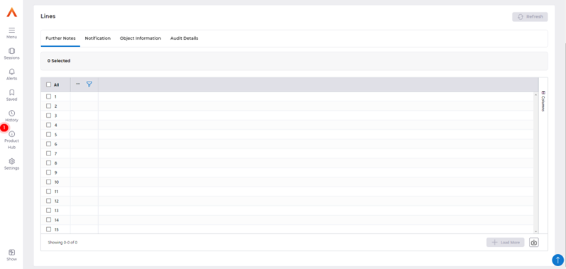
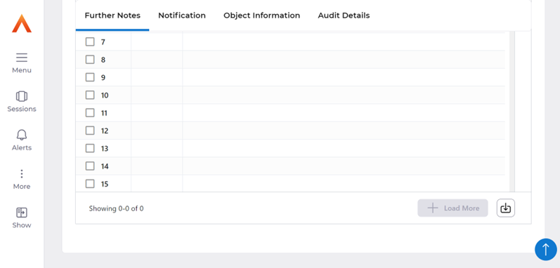
The horizontal tabs are currently presented in various parts of the Financials application, where there are multiple data grids or inputs on one screen.
Upon zooming in to the screen and scrolling down, the horizontal tabs are now frozen, similarly to the vertical tabs which allow the user to scroll through the screen whilst accessing the primary tabs and actions.
Radio Buttons
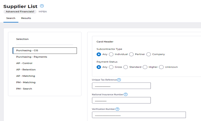
Above screenshot shows how radio buttons are displayed in the new UI.
When there are up to 7 radio buttons, they would be accommodated in the same row and if more than 7, in the next row.
Wizard Workflows:
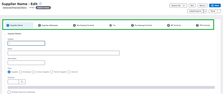
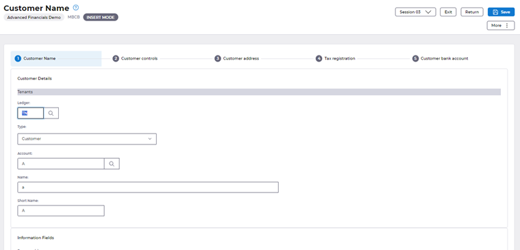
As per the customer feedback we have implemented a wizard style for the Supplier/Customer workflows.
Wizard workflow offers a step-by-step sequence of screens that guide users through the complex process of creating/managing suppliers and customers.
It is a way to break down a larger task into smaller, more manageable steps, making it easier for users to understand and complete the process. Previously users required knowledge of the specific steps to follow to complete a process, users are now better guided to know what the next step in the process is for completion.
Supplier Workflow
Customer Workflow
V1 & Paperclip columns merged.
V1 & Paperclip is merged to the same column in the new UI as shown below in a new column header named ‘Attachments’. The intention of this is to reduce the need for training and confusion caused in having two columns offering attachments and by having a single column which offers both V1 & Paperclip in respective icons.
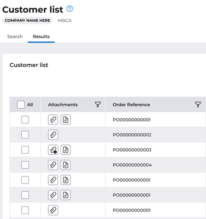
The new design will cater for the double click which was previously present in the current system.
Paperclip:
Paperclip icon: If there are some records, user can add new attachments via the paperclip icon.
Paperclip with the Add icon: When there are no records, user can add new item immediately. This reflects the double click functionality currently present.

V1 (Read only):
Document icon: shows the V1 records.
No icon: user doesn't have an option to open the empty record.
Advisory Text
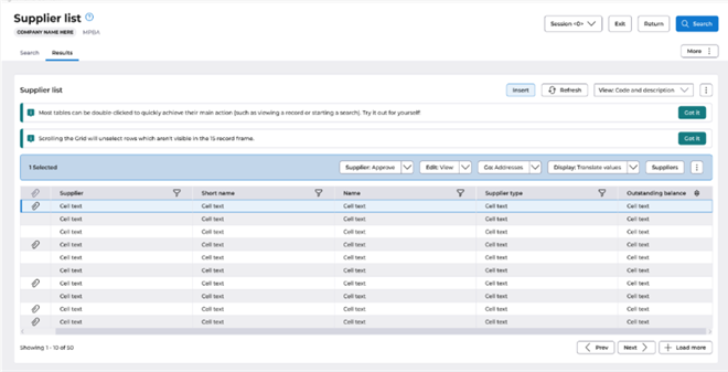
Two advisory text messages would be displayed over the AG grid for the first-time users.
Once ‘Got it’ button is clicked, the notification will not appear again for that user. Advisory texts explain about the double click action which is available in AG grid and that scrolling would unselect the rows which aren't visible in the 15-record frame.
Function Search Improvement
In the new UI, users can find a map using the function search which is available on the menu and the home page as shown below.
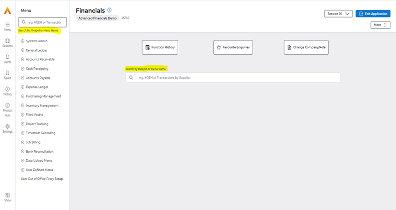
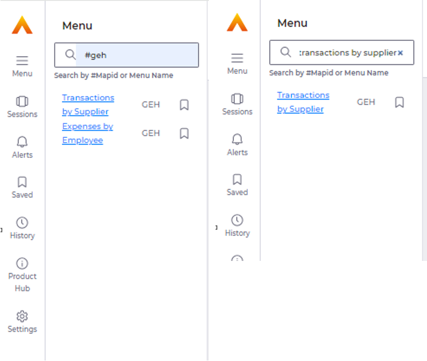
Search could be executed either by the map id (by replacing ‘M’ in the Map ID by a #) or by Menu Name.
Menu Search
Home Screen Function Search


Favourite Enquiries
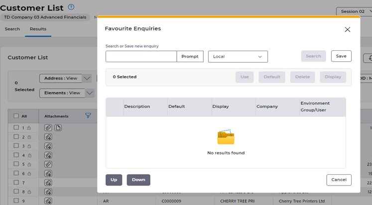
In the New UI, “Favourite Enquiries” will be placed in the More Kebab Menu as shown below:
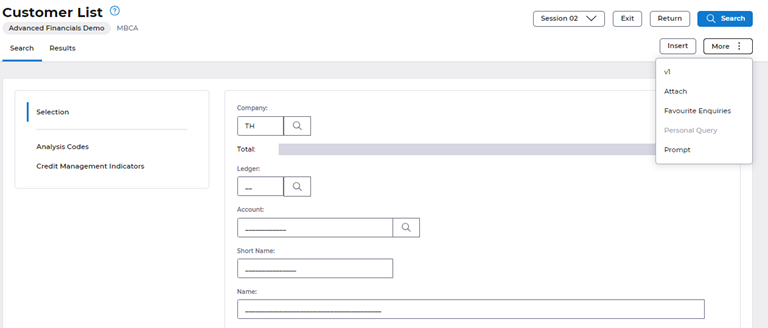
When User Clicks on the “Favourite Enquiries” Button, the below shown Dialog Box appears which will show a list of Saved Parameters which can be navigated to depending on user preferences:
